

Vol. 38 (Nº 21) Año 2017. Pág. 31
Orlando SABOGAL 1; Diego ESCOBAR 2; Juan HINCAPIE 3
Recibido: 11/11/16 • Aprobado: 28/11/2016
ABSTRACT: Data visualization is a growing field of research. It is used in a wide range of disciplines, its main objective is to associate relevant abstract data to represent and communicate information in a visual context; producing new knowledge and providing the opportunity to discover hidden patterns in data. Transportation research uses concepts and tools from other sciences such as geographic information systems, statistical modeling and — recently — big data mining. Data visualization is worth of consideration as a new useful technique in transportation, framed as an intelligent transportation system ITS. This article proposes and implements three web-based visualizations to analyze transport data and interact with it: “Desire Lines” explore flow travel patterns from an origin-destination matrix survey, “Cumulative Opportunity” displays dynamic results from an accessibility cumulative opportunity model and “Coverage Analysis” presents a distance-coverage analysis within pedestrian network to Bus Rapid Transit (BRT) Megabús stations. The visualizations that were developed make the analysis and interpretation process of data easier and allow the viewer to gain insight on the transport system in the studied area; data becomes more comprehensible and accessible. |
RESUMEN: La visualización de datos de transporte es un campo de investigación en constante crecimiento, el cual se usa en una amplia gama de disciplinas. Su principal objetivo es asociar datos abstractos relevantes para representar y comunicar información en un contexto visual, produciendo nuevos conocimientos y proporcionando la oportunidad de descubrir patrones ocultos en las bases de datos. La investigación sobre el transporte utiliza conceptos y herramientas de otras ciencias, como sistemas de información geográfica, modelización estadística y - recientemente - minería de datos. La visualización de datos se considera como una nueva técnica útil en el transporte, enmarcada dentro de los sistemas inteligentes de transporte ITS. Este artículo propone e implementa tres visualizaciones basadas en la web para analizar los datos de transporte e interactuar con él: "Líneas de deseo" explora los patrones de viaje a partir del análisis de una matriz origen-destino, "Oportunidad acumulada" presenta de forma dinámica los resultados del modelo de accesibilidad acumulada aplicados en la ciudad; “Análisis de Cobertura "presenta un análisis de cobertura a distancia dentro de la red peatonal a las estaciones Megabús de Bus Rapid Transit (BRT). Las visualizaciones que se desarrollaron facilitan el proceso de análisis e interpretación de los datos y permiten al espectador conocer mejor el sistema de transporte en el área estudiada haciendo que los datos se vuelven más comprensibles y accesibles. |
Nowadays in transportation, either motorized, non-motorized (bikes and afoot), air transport or maritime transport there is a lot of information captured and stored by people, private companies and public agencies that is difficult to analyze and understand (Tong et al., 2015; Chen et al, 2007). This has become more tangible with the big data explosion in many fields (finances, text mining, social network analysis, manufacturing, etc.) (Fairbairn, 2005) in which many approaches have been considered to address data issues; machine learning, data mining and data visualization techniques have become part of the standard toolkit (Nagel and GroB, 2014).
When focusing on transportation data it is important to mention services as Open Street Maps (OSM) or Google Maps, among others, which provide cartographic information and transport infrastructure data supported in Geographical Information Systems (Carvalho, 2009). With these services regular people can locate points of interest, calculate the shortest paths for traveling or look up public transport schedules. People also record speed and acceleration information using Global Positioning Systems (GPS). The main focus of this research is to show three visualizations types (Desire Lines, Cumulative Opportunity Model and Coverage Analysis) to understand and interact with transport data and raise awareness on the fact that this field can be used in transport analysis (O’Sullivan et al, 2000) to develop many kinds of Intelligent Transportation Systems (ITS) useful for policy and decision making (Anwar et al, 2014). Desire Lines show the flow of travels between zones in such a way that travel information can be aggregated or disaggregated by purpose and mode. On its turn, the main idea of the Cumulative Opportunity Model is to show the total amount of opportunities that every zone, within an urban area, reaches in a defined threshold. Coverage Analysis aims to explore the quantity of territory and population covered from every station for different buffers (Nagel et al, 2014).
The implemented visualizations exemplify the application of data visualization techniques to transport, helping in analysis processes and data exploration. Visualizations are data products where information is usable and accessible. All of the visualizations implement zooming capabilities, reactivity to user–mouse instructions and menus for setting different options.
The current work is an effort to put transportation visualization in the state of the art literature and promote an academic debate about adopting this technology and identifying different kind of uses and benefits. In a broad sense, data visualization in transportation must be seen as a new branch requiring exploration and further research. Furthermore, visualizations can be seen as a complementary instrument for transport analysis tools such as geographic information systems, transport modelling software or data processing tools (Isenberg et al, 2013).
The main idea in Desire Lines (available at http://sirius.utp.edu.co/sirius/d3/lineas/) is to exhibit flow travels between zones; travel information can be aggregated or disaggregated by purpose and mode. Visualization is basically a map from Pereira and Dosquebradas with TAZ (Traffic Analysis Zones) partitioning where lines appear and disappear according to settings configuration. Figure 1 illustrates an example (Pereira has a grey color and Dosquebradas an opaque blue.)
Flows are plotted only for selected TAZ and those TAZ with interactions, there is a differentiation for flows from that TAZ or to that TAZ. Line widths are proportional to the amount of people travelling between each paired TAZs. Map has zooming capabilities that can be used with the buttons located on the upper left corner of the visualization or through the scrolling wheel of the mouse. Under the zooming button is the information menu that provides basic facts according to what is being displayed in the visualization.
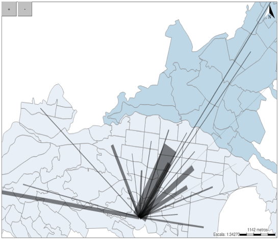
Figure 1. Desire Lines visualization.
-----
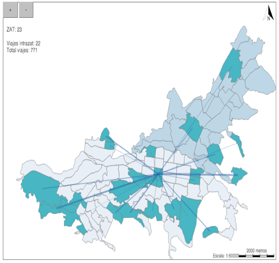
Figure 2. Visualization reaction when mouse hovers over a selected TAZ.
When the mouse hovers over the selected TAZ then that specific TAZ and all the other TAZs that interact with it are highlighted. This makes it easier to identify areas involved in a particularly analysis. Besides that, information about intra zone trips and total trips is given in the information menu (See Figure 2, top left).
On the other hand, when a line is selected (See Figure 3) origin TAZ, destination TAZ and lines are highlighted and the information menu is updated to show the total flow and the origin-destination pair. Information for Desire Lines is obtained through an origin-destination matrix survey where a questionnaire is applied to a population sample.
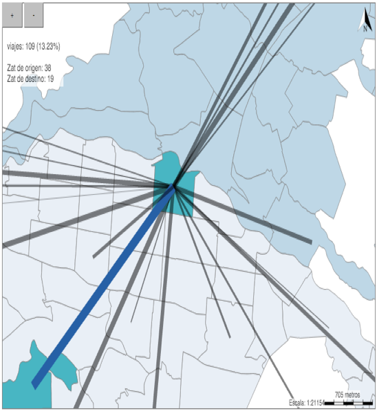
Figure 3. Click on a line highlights involved TAZs
Each person is asked to tell his or her frequent trips and its related origin and destination TAZ, trip purpose and transportation mode used. There are “n” individuals, “t” TAZ, “m” modes and “p” purposes. A regular dataset is expressed in a table where each row is a trip and columns refer to mentioned variables as in Table 1. Information from Table 1 must be converted into a matrix like that in Table 2 for each combination of purpose “p” and transportation mode “m”.
ID_Trip |
Origin_TAZ |
Dest_TAZ |
Purpose |
Mode |
1 |
O1 |
D1 |
P1 |
M1 |
2 |
O2 |
D2 |
P2 |
M2 |
… |
… |
… |
… |
… |
n |
On |
Dn |
Pn |
Mn |
Table 1. Data variables in an origin destination table.
-----
TAZ / TAZ |
1 |
2 |
… |
m |
1 |
F11pm |
F11pm |
F11pm |
F11pm |
2 |
F11pm |
F11pm |
F11pm |
F11pm |
… |
… |
… |
… |
… |
t |
F11pm |
F11pm |
F11pm |
F11pm |
Table 2. Sub-Setted matrix.
These matrices are at the heart of the visualization and are called and sub-setted according to input parameters. This process is basically to create “m*p” pivot tables. It is important to notice that all matrices are square matrices with “m” rows and “m” columns. If there are no trips from a certain origin to any destination the zeros row must remain. Similarly, if there are no trips to a certain destination the zeros column must remain. The TAZ map must have also “m” zones ordered as in the square matrices or with an identification variable to link zones in the map with values on matrices.
2.2. Cumulative Opportunities Model
The main concept underlying this visualization (available at http://sirius.utp.edu.co/sirius/d3/cai/) is to show the total amount of opportunities that every zone within an urban area reach in a defined threshold. The result is a thematic map (See Figure 4) where color intensity is proportional to the attained opportunities quantity.
Visualization works for two kinds of activity nodes, health opportunities and security opportunities, and can be switched using the blue button located on top of the map. Health opportunities include both, public and private hospitals or clinics while security opportunities include police stations, immediate attention commands (CAIs for Comandos de Atención Inmediata in Spanish) and the central command. Zoom in and zoom out can be performed with the buttons located on the top left corner of the graphic or with the scrolling wheel of the mouse. The input slider allows to configure the threshold of time (in minutes). The map is updated instantly.
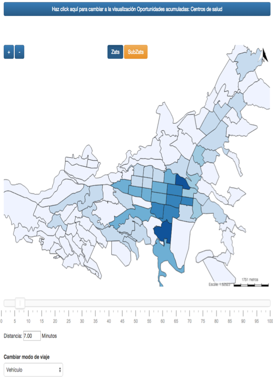
Figure 4. Cumulative opportunities visualization
Visualization can be set for motorized transportation, biking or pedestrian mode. Additionally, zones aggregation can be selected between TAZ and SubTAZ (TAZ divisions). Every time the mouse hovers over a TAZ it is highlighted and a tooltip appears indicating how many opportunities it is reaching. If the user clicks on any zone of the map, it changes its colors to default “Desire Lines” map, with the area of Pereira in grey and Dosquebradas in blue for security opportunities, and grey and opaque blue, respectively, for health opportunities.
Moreover, the selected TAZ is highlighted and at same time points representing reached opportunities are plotted (See Figure 5). Opportunities are colored according to their classification. For security activity nodes CAIs are green, police stations blue and commands purples; on the other hand, public hospitals are pink and private hospitals are yellow. Finally, if the mouse hovers over a reached opportunity a tooltip appears showing information about it.
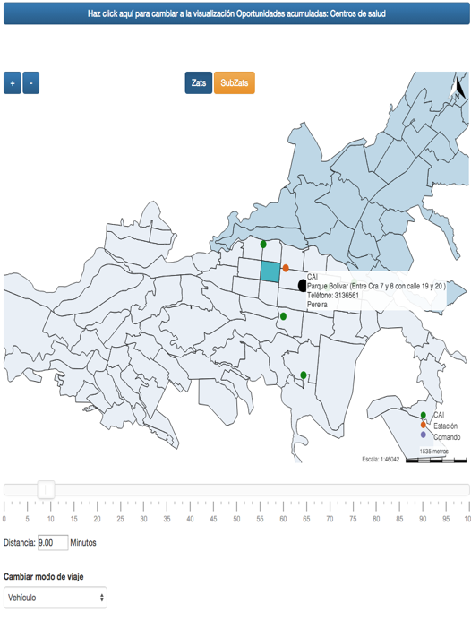
Figure 5. Opportunities reached for selected zone.
Visualization inputs are distances matrices for TAZ and SubTAZs for every transportation mode and for every type of opportunities. These matrices are “mi” by “nj” where “mi” is the total zones in area (m1=98 for TAZ and m2=135 for SubTAZ) and “n” is total opportunities (n1=373 for health opportunities and n2=23 for security opportunities). According to the type of opportunity selected (health or security), the area (TAZ or SubTAZ) and transportation mode (motorized, bike, afoot) the visualization calls the corresponding matrix. Finally, the visualization makes a filter over the required matrix according to an established threshold and selects and counts opportunities. Furthermore, there are maps for TAZ, SubTAZ and opportunities locations linked to matrices through ordering or identification variables. Opportunities location were built from scratch using geographic information systems, TAZ were taken from the Matrix Origin Destination Survey (AMCO 2008) and SubTAZs which are TAZs partitions created in order to represent more concise urban structures.
For calculating distance matrices first there must exist a lines vector shape file (or similar) representing transport infrastructure including street directions, intersection, geographic location and speed values for pedestrian, bicycles and vehicles on every street. Second, centroids for TAZ and SubTAZ must be calculated and finally, travel times from centroids to opportunities must be computed. This process was made using TransCAD 5.0 Academic Version.
2.3. Coverage Analysis
Coverage Analysis (available at http://sirius.utp.edu.co/sirius/d3/cobertura/) focuses on Megabus, a bus rapid transit system with 40 stations operating in Pereira and Dosquebradas since 2007. This visualization aims to explore territory and population covered from every station for different buffers and see merging relations. The basic idea is to calculate an area polygon that is covered from each station for an established distance value over the transportation network.
As a in the two previews visualization the geographic context is given by a background map, this time being a tile from OpenStreetMaps. Figure 6 shows Pereira and Dosquebradas map with located stations as green points. Zooming buttons on the upper left corner and a buffer menu for selecting different thresholds (150 meters, 250 meters, 300 meters and 400 meters; see Figure 7).
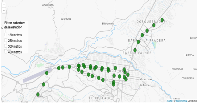
Figure 6. Coverage Analysis visualization.
-----
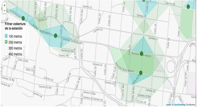
Figure 7. Coverage Analysis visualization with two selected thresholds.
Each time a buffer is selected the visualization plots polygons; it works as a layer similar to those used in geographic information systems. If the user selects a station, when at least one polygon layout is active, the visualization deletes all the other polygons and highlights the areas related to the selected station and when the mouse is located over a buffer a tooltip shows information about area and population (See Figure 8).
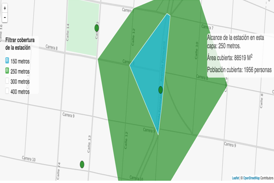
Figure 8. Coverage Analysis when a station is selected.
Stations information was obtained using OpenStreetMaps and verified in field work visits. The result obtained is a geographic file with longitude and latitude coordinates for stations and an identification variable. Distance calculations were performed in a similar way to “Cumulative Opportunities”, the same network was used and the travel time calculations were computed from every station to all nodes (intersections) in the network obtaining a “l”x”k” distance matrix (“i” are stations and “k” are all nodes in the network). Stations order in the distance matrix (row position) is the identification variable in the stations geographic file.
Polygons are calculated for every station in a defined threshold following the next steps: First the desired station position must be found in the distance matrix, that is: selecting the related row. Second, a filter is applied to all rows requesting column positions for which travel time is lower or equal to the threshold.
After that, the station geographic file is used to make a subset for filtered columns. Finally a convex hull for the points is calculated finding the station polygon. Last procedure must be repeated for every station and for all thresholds. Adopted data structure consists in creating a vector shape file for every threshold containing all station polygons.
Each one of the visualizations made has a defined purpose and tells different stories which users can explore and examine. “Desire Lines” seek to serve as a tool for exploring travel patterns from the 2008 AMCO origin–destination matrix survey. It also helps to easily detect the zones which generated the most travels and the zones which received or attracted more trips. It also allows to detect interacting zones with ease. Visualization succeeds in absorbing complex information and transforming it into an intelligible, coherent, logical and comprehensible data product.
“Cumulative Opportunities” is a dynamic and interactive adaptation of standard cumulative opportunities model applied to Pereira and Dosquebradas considering TAZ and SubTAZ divisions and health and security activity nodes. Visualization shows zones with the best accessibility and zones with lack of accessibility for different settings. An additional capability in the “Cumulative Opportunities” model is that it shows information about reached opportunities imitating functionalities from advanced traveler information systems (ATIS).
Lastly, “Coverage Analysis” calculates covered area by Megabus BRT stations for an arranged group of buffers considering distances over transport infrastructure; it plots polygons from every station indicating covered area. This way, it is easy to recognize zones in urban shape with good or bad bus rapid transit services and to identify redundant stations that cover the same spatial area.
In General, future works must try to design and implement novel visualizations from transport related data, using open data sources deserves peculiar attention. With big data explosion over the last years many new kinds of information are available in huge datasets which are very difficult to analyze and understand. For instance, there are Global Positioning Systems (GPS) recordings with route tracks, speed, acceleration and stopping data for many vehicles, private and public. There is also data from mobile phones that is being used to model building and that could become input for visualizations. An important issue is transport data for developing countries where the technology access gap is wider; making it unusual to store and make public any kind of data.
“Desire Lines” implementation can be improved in three ways. First, there is more information in origin-destination matrix survey about population characteristics and trip dynamics that is not being used in the visualization. For example: trips can be disaggregated by aging groups, gender or economic stratification. Also, it could be convenient and effective to display travel time between highlighted TAZ for set parameters. As the origin-destination matrix asks for the starting time of the trip and the frequency in a typical week, desire lines can be calculated for day intervals. This means to add a new parameter setting.
Second, for analysis purposes it could be more appropriate to see information for combined TAZ groups rather than one by one. This is a complex task because it requires designing a method for TAZ selections and additional data processing.
Last, “desire lines” visualization could be thought as a software product allowing users to load their maps (vector files) and raw data and interactively construct a data product as desired.
In “Coverage Analysis” visualization more variables can be added. Although the area and total population covered is an index for station locations and potential demand, it does not say anything about how many passengers are actually moving through them. Moreover, if an origin destination matrix for bus rapid transit system Megabus is calculated then a visualization combining desire lines for public transport and Coverage Analysis could be implemented.
This work is part of some developments two authors (Orlando Sabogal and Juan Hincapie) did while they were working at “Centro de Investigación y Desarrollo Tecnológico” (CIDT) at “Universidad Tecnológica de Pereira” (UTP), they want to express their gratitude for the opportunity.
Visualizations were made in “Proyecto de Accesibilidad” at “Intelligent Transportation Systems” ITS research line in CIDT with a remarkable work by people who were engaged to this project; we want to express a special acknowledgment to Sebastian Silva, Vanessa Velásquez and Andrés Giraldo. Mr. Silva implemented most of the code used in visualizations, Ms. Velásquez helped with valuable feedbacks and Mr. Giraldo recollected most of the geographic information. Visualizations would have not been possible without the financial and academic support of Sirius Research Group at Universidad Tecnológica de Pereira.
Authors also want to highlight that “Área Metropolitana Centro Occidente” provided the 2008 Origin Destination Survey used in “Desire Lines” and “Cumulative Opportunities” Visualizations.
A. Anwar, T. Nagel, and C. Ratti, (2014). “Traffic Origins: A Simple Visualization Technique to Support Traffic Incident Analysis,” in Proc. In Proceedings of the Pacific Visualization Symposium (IEEE PacificVis 2014), pp. 316 – 319.
C.M. Carvalho, (2009). “Collaborative Geographic Visualization,” M. S. Thesis, Dept. Sciences and Environmental Engineering, Nova Lisboa University, Lisboa, Portugal.
C. Chen, WK. Hardle and A. Unwin (2007). Handbook of Data Visualization: Berlin: Springer Berlin Heidelberg, pp. 15-56.
D. Fairbairn, (2005). “Geovisualization Issues in Public Transport Applications,” in Exploring Geovisualization, J. Dykes, A.M. MacEachren, M.J. Kraak Ed., Pergamon Elsevier, Chapter 26, pp. 513–528.
D. O’Sullivan, A. Morrison, and J. Shearer, (2000). Using desktop GIS for the investigation of accessibility by public transport: an isochrone approach. International Journal of GIS, 14(1), pp. 85–104.
L. Tong, X. Zhou and H.J. Miller, (2015). “Transportation network design for maximizing space-time accessibility,” Transportation Research Part B: Methodological, Vol 81, part 2, pp. 555-576.
P. Isenberg, T. Isenberg, T. Hesselmann, B. Lee, U.V. Zadow, and A. Tang, (2013). “Data Visualization on Interactive Surfaces: A Research Agenda, IEEE CG&A 33, 2.
T. Nagel and B. GroB, (2014). “Shanghai Metro Flow - Multiple perspectives into a subway system,” in Proc. of the IEEE VIS 2014 Arts Program, VISAP'14: Art+Interpretation, Paris, France, pp. 137-138.
T. Nagel, M. Maitan, E. Duval, A.V. Moere, J. Klerkx, K. Kloeckl, and C. Ratti, (2014). “Touching Transport - A Case Study on Visualizing Metropolitan Public Transit on Interactive Tabletops,” in Proc. of Advanced Visual Interfaces AVI ’14, Como, Italy, pp. 281–288.
1. Sirius Research Group at Universidad Tecnológica de Pereira. Email: orlando@sirius.utp.edu.co
2. Universidad Nacional de Colombia, Faculty of Engineering and Arquitecture, Civil Engineering Department. Email: daescobarga@unal.edu.co
3. Faculty of Engineering, Program of Computer Science, Director of the Sirius Research Group at Universidad Tecnológica de Pereira. Email: judaz@sirius.utp.edu.co